Logos
What makes an exceptional logo?
Identity design, branding
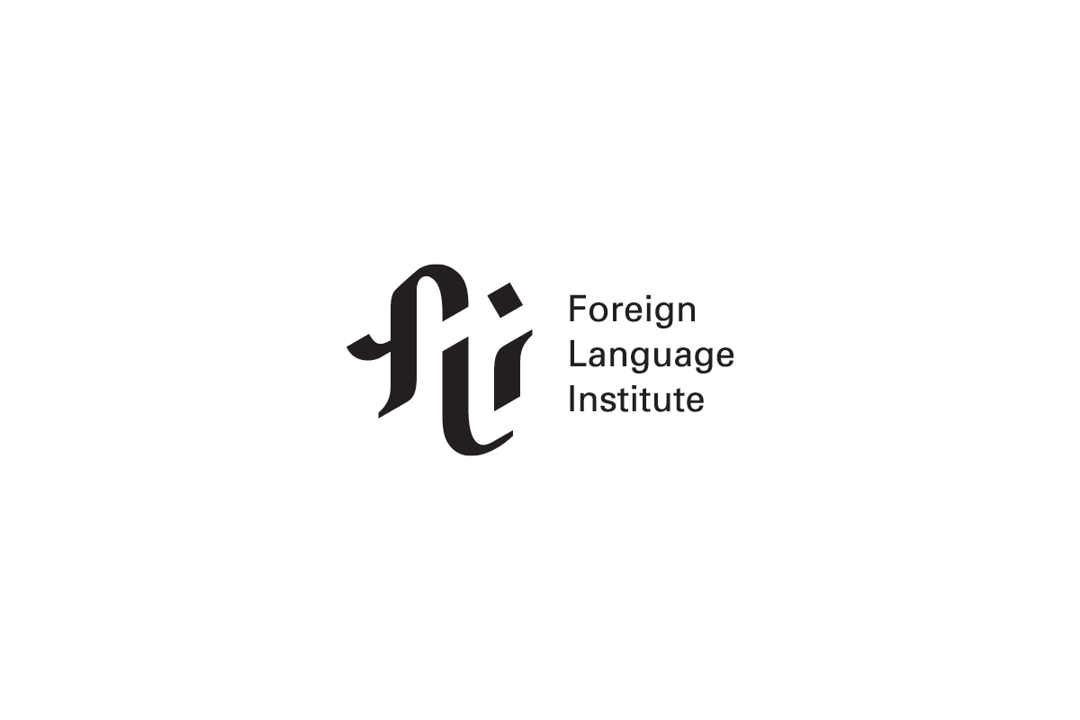
Foreign Language Institute
Higher Education
FLI is an intercollegiate program that offers courses in less commonly taught languages such as Portuguese, Arabic, Chinese, and Russian. The mark draws on the thick and thin lines found in traditional scripts across languages.
A really good logo is memorable and recognizably unique. Paired with a smart identity system, it 1) helps visually establish what your brand is all about and 2) distignuishes your brand amongst the competition.
When working with a rebranding project, the first step thing to evauluate is what kind of mood does the brand want to evoke. Every company has an aspirational personality balanced with realistic expectations from their consumers/clients. Some brands seek to be splashy and bold. Others know that a more restrained approach is more appropriate for their audience and offerings.
For example, in the above logo for the Foreign Language Institute, is bold but clean. It reflects the program's formality while utilizing a foreign-looking FLI mark to give it the personality it needs to really give it that extra polished and elevated look. It's then paired with its full name, typeset in a large utilarian font.
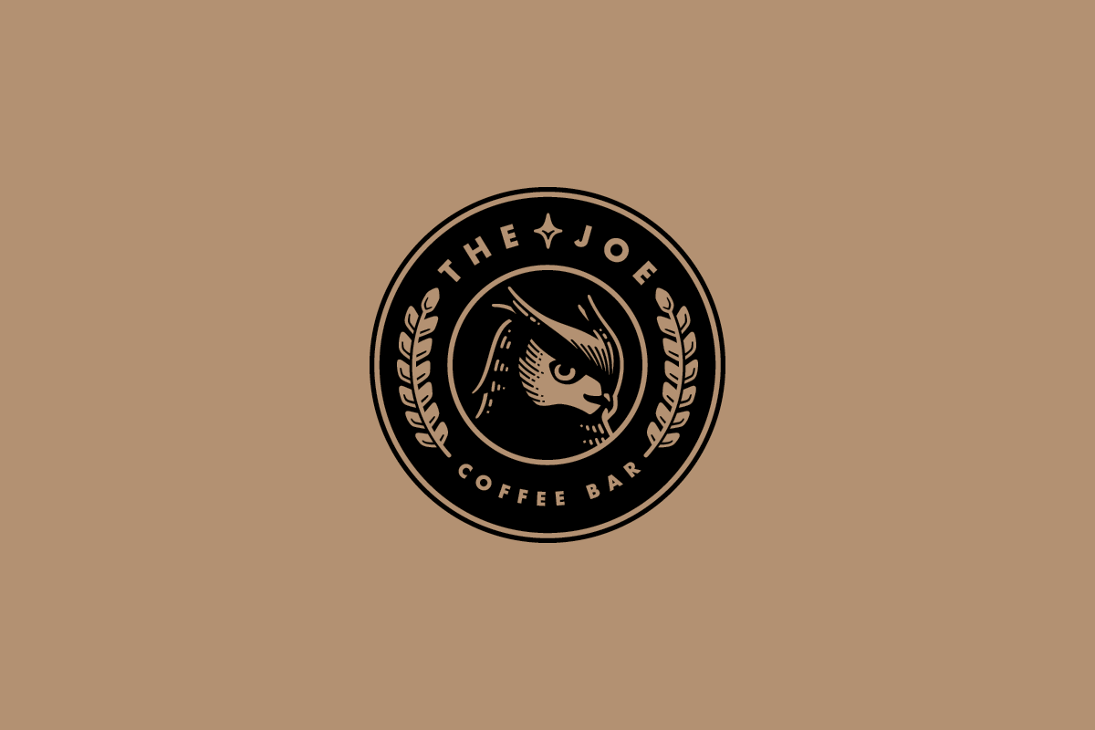
The Joe
Hospitality
The Joe is a coffee bar located in a chain of high-end student housing developments. The client chose this final owl emblem for its sleek boldness and its immediate visual connection to a cup of coffee.
Agency: Studio Mercury
For another example, we have the emblem developed for The Joe, a chain of student coffee shops. Because The Joe is a in-house chain located in exclusive student housing, it made a lot of sense to co-opt the synonymous coffee shop stamp/sticker look. The client ultimately chose this direction because they liked how the circle emblem immediately said "coffee" at first glance, and there wasn't any need to worry about visually competing with Starbucks because it wasn't a public chain.
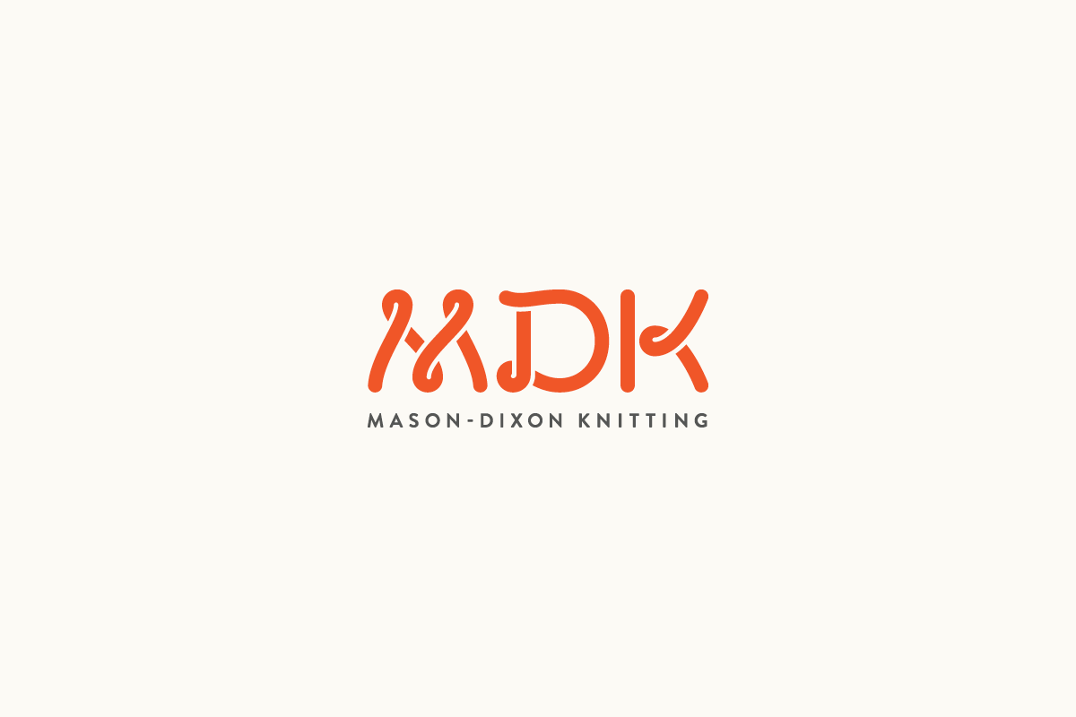
Mason-Dixon Knitting
Blog / Retail
MDK is a knitting blog and online shop full of charm, wit and warmth. This mark using thick custom-drawn yarn letters was developed as part of the site's rebrand.
Agency: Studio Mercury
The actual name of the brand also has a lot to do with how the logos are strategically developed. Many times, the logos I work on are rebrands. The company has some traction and name recognition and they want to make things look more professional. The caveat is that they sometimes come with long names—but that's okay!
On a case by case basis, I look at whether it makes sense to rename, abbreviate or just embrace the length.
In the case of Mason-Dixon Knitting, the client liked the idea of shortening the name to MDK. Their decade-old blog had a sizable following with good name recognition, but they felt a small disconnect with their name due to its ties with the civil war (they originally coined the name in reference to the pen pal nature of their co-founders, one being from the South and the other from the North). Plus, with the design of the yarn letters, it just sealed their decision.
CMC Motorsports
Retail
CMC Motorsports is a trusted source for Formula 1 racing merchandise. This sleek custom logotype was developed for the family-operated retail company.
Agency: Studio Mercury
On the other hand, there wasn't a way to elegantly break down the words with CMC Motorsports. They were also married to the name. Therefore, I just had to design around it. Although the final lockup ended up being quite long and horizontal, it worked out because the company is an online-only retailer of official F1 racing gear. Their main use for the logo was for their business card and their online store.
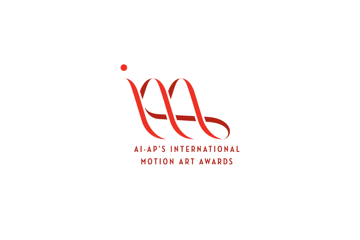
International Motion Art Awards
Award
This mark that spells out IMAA was designed to emphasize the fluidity and elegance of animation.
Agency: Mirko Ilić Corp.
Coming in at a whopping 37 characters, AI-AP International Motion Art Awards begged to be shortened to IMAA. Similarly, the Institute of Economoic Democracy was shortened to INED, giving the perfect oppporutunity to design meaning within the letters.
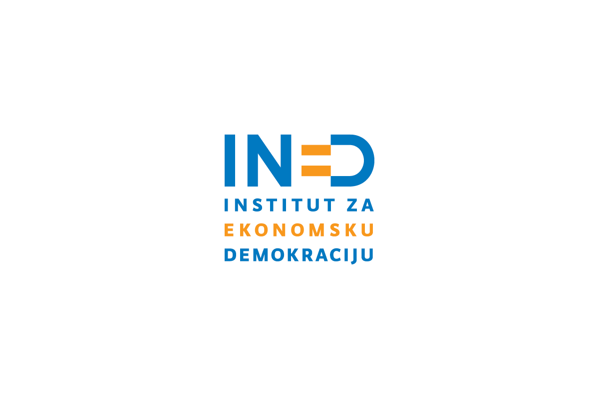
Institute of Economic Democracy
Non-profit
In this abbreviated logotype, the E is turned into an equal sign that can also be read in conjecture with the D as a happy face or a spark plug.
Agency: Mirko Ilić Corp.
For the School of the Museum of Fine Arts at Tufts, the name was abbreviated to SMFA at Tufts for the logo. This interim logo was used after the SMFA Boston was acquired by Tufts University. The logo was quickly created to match the new branding which was scrappy but elegant and straight-forward. The logo also honors from the original red square SMFA logo.
School of the Museum of Fine Arts at Tufts
Higher Education
As part of its acquition by Tufts, SMFA went under a rebrand to feel more modern. Because the old logo was in use for so many yeras, the new logo was developed with its predecessor in mind. Swipe to see the before.
Agency: Studio Mercury
Drawing inspiration from a clear vision
Most of the time, clients come in with a blank slate in mind, but once in a while the project comes attached with a clear vision. Below are some examples of that in the logos for real estate properties (The Holly and The Madison) and hair extension start-up (Voël).
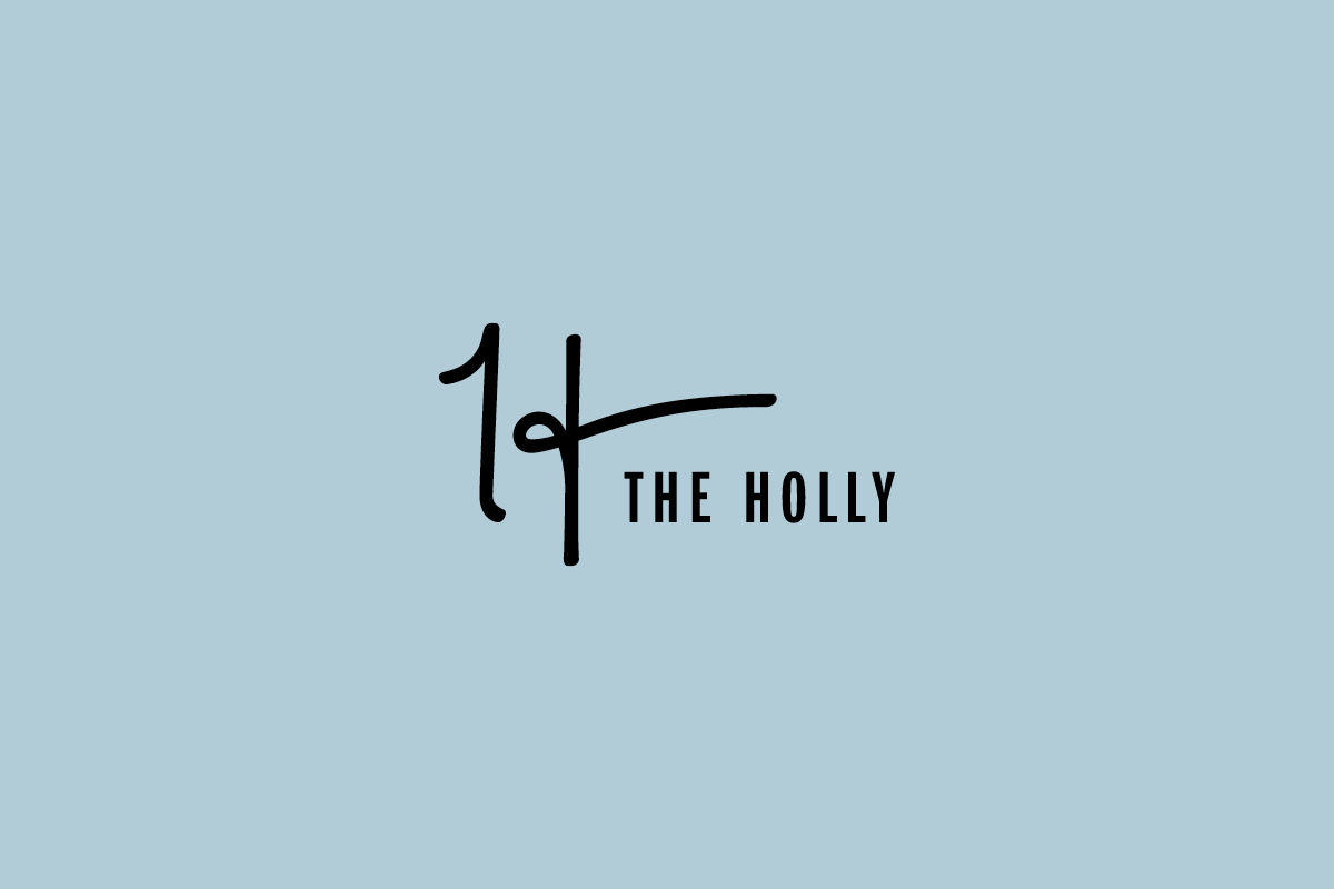
The Holly
Real Estate
Located in Lubbock, the Holly is named after Buddy Holly. Accordingly, the mark is inspired by his signature and the soft vintage colors of his era.
Agency: Studio Mercury
The Madison
Real Estate
For The Madison, the client very clearly asked for a Miami-inspired mark.
Agency: Studio Mercury
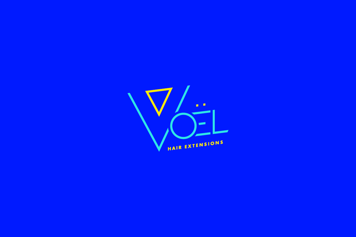
Voël Hair Extensions
Beauty
The founder of Voël wanted her hair extension company to be set apart. She wanted it to be bold, funky and inspired by the 80s.
Agency: Studio Mercury
A flexible logo system
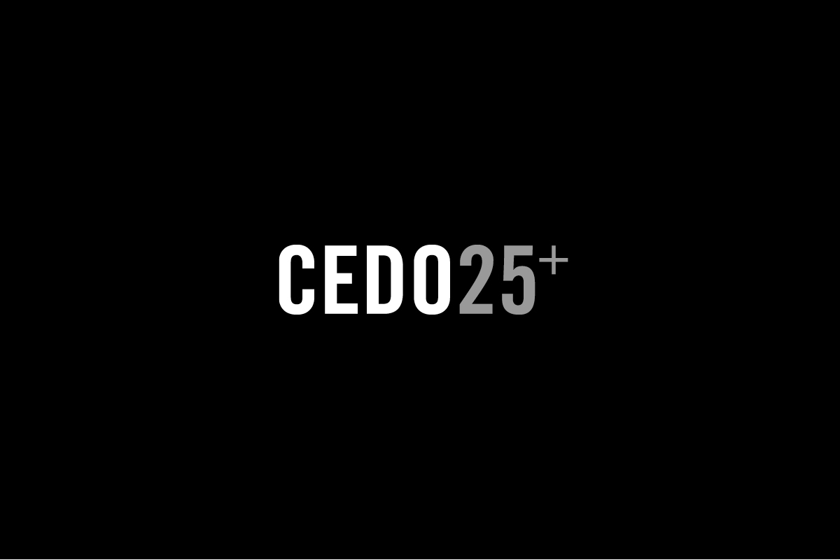
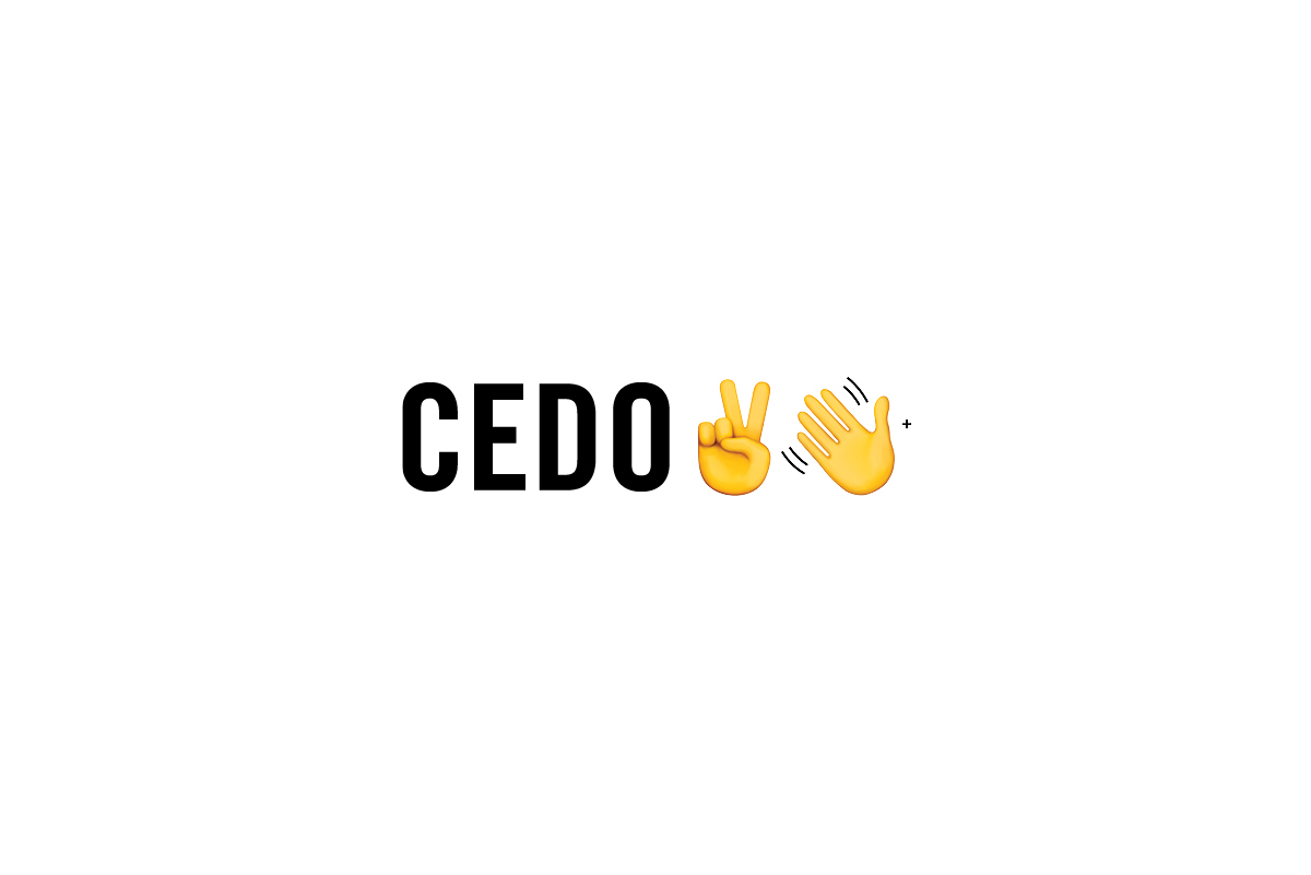
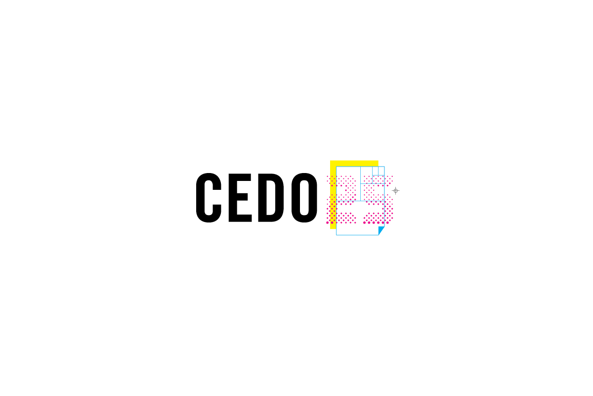
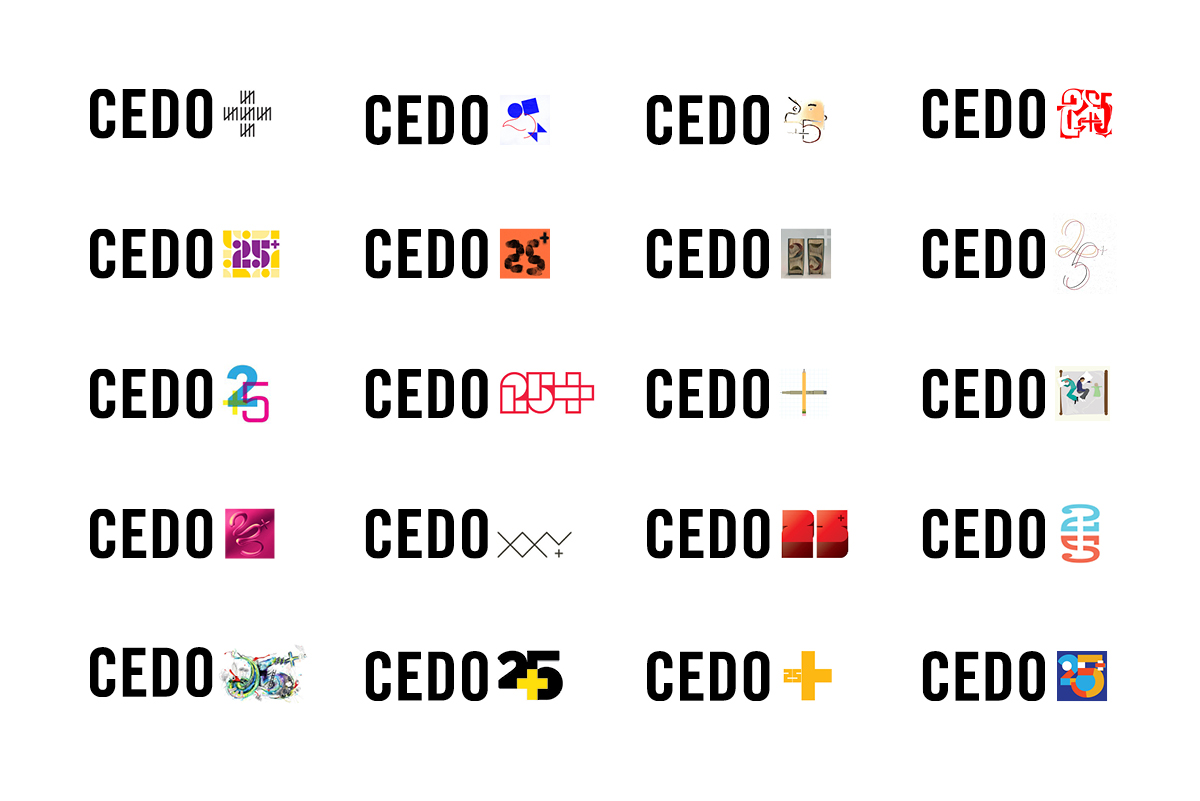
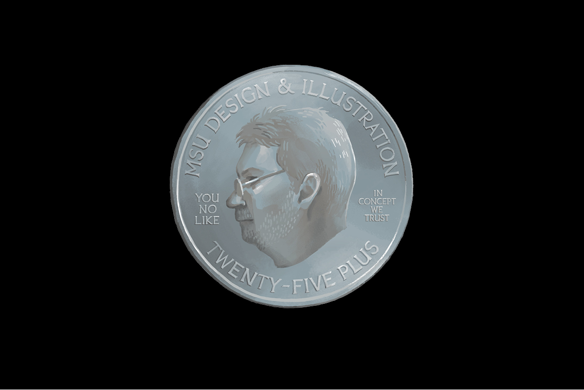
One of my favorite logos I've worked on was for the Cedo25+ exhibition. As part of the exhibition, we invited designers to submit to the flexible logo system by creating their own 25+ art. The exhibition featured a lot of talented designers and you can see below how participants came up with wildly different solutions along with the ones I created to get things started.
Cedo25+
Event / Exhibition
A flexible logo was designed to encourage design alumni to participate
and showcase their own 25+ designs. Full case study available.
Agency: Studio Mercury